
 Primary colors
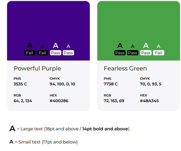
Kennedy Krieger’s primary brand color is Powerful Purple. It should be used for a majority of elements such as headlines and color floods and may be used in varying opacities. Fearless Green is the brand’s primary accent color. It should not be as prominent as purple but can be used in headlines and small floods.
Secondary colors
Secondary colors are used sparingly to create variation, focus attention or differentiate items. They can be used for things like icons and graphs or in illustration. They should not be used in large floods or as main text colors.
Neutral colors
Black and shades of gray are used for backgrounds, text and other elements that don’t require color.